Kidlit

Season 2019 Recap!

This is the fastest way to sum up 2019

This is the fastest way to sum up 2019

Uh, it’s been like 15 months, where have you been?

I forgot I had a blog. Well, not really, but I practically did because of how absolutely off the rails 2019 went. When last we spoke, gentle reader, I was wrapping up Juneicorn in 2018. Then suddenly— ! It was 2019! And then, suddenly— ! It was less than 30 days until THE END OF THE DECADE.

Let that sink in for a moment.

So skipping over the second half of 2018 cuz it was mostly job hunting, training, and freelance work, what exactly went on in 2019 for me? Let’s get caught up. Get a cuppa, this might take a minute.


Fox TV

January started out with wrapping up two longterm freelance projects I had at the end of 2018, Aspen Mascots and some more work for Learning A-Z, but we’ll come back to those. As is the way of the entertainment industry, a sleepy, overcast day where I was deep into Kondo-ing my house got completely flipped on its head with one phone call.

I legitimately misheard the voicemail as “This is (name) from AMERICAN DEBT calling!” and I started to sweat.

I legitimately misheard the voicemail as “This is (name) from AMERICAN DEBT calling!” and I started to sweat.

So next thing I knew, I was walking into the Fox TV studios for my first day of work as a Storyboard Revisionist on the show American Dad. I have done quite a bit of storyboard work for independent animated shorts, commercials & whathaveyou, and even in-studio at Snapchat (which I guess I never mentioned in 2017/2018… whoops) but this was my very first job at a traditional animation studio. It’s been a lovely, wonderful rollercoaster ever since. The crew is amazing, the job has been challenging and fun, and I’ve learned more than all 8 years of art school and 6 years of freelance combined in a short 12 months. Take THAT, Master’s Degree!

Aspen Mascots Graphic Novel

February rolled around, and my next piece of amazing news dropped— Aspen Mascots was going to be released as a trade paperback graphic novel! I could hear 2015 Joie “SCREEing” through timespace when I got to hold this baby in my hot lil’ hand! It even had distribution in bookstores and Targets, not just comic book stores!

aspengraphicnovel.jpg

Conventioneers

But then March was like “hold my beer” because all of the things I had committed to do before getting the job at American Dad started to dovetail, much to my stress levels’ chagrin.

First, I had signed up to do a project that would debut at Emerald City Comic Con with my creative partner Jackie Ball, and it was a real doozy— an interactive comic ARG (alternate reality game; in this case, essentially a scavenger hunt) about two plucky child heroes very into cryptids and paranormal mysteries. This project deserves its own post, so I won’t wax poetic about it now, but needless to say it easily required 500+ hours of work (especially folding and stapling), and I pulled more all nighters than the entirety of my art school days combined. Thank goodness for very good friends who volunteered their time to help us pull this together.

The project went off with several hitches (as projects like these do) but we called it a success! We had at least 6 players fully complete the entire game, AND they said they had fun. Win!!

WonderCon & Mare the Merrier

Second, WonderCon was once again coming up, and because of how busy I’d been, I felt a little underprepared. That said, I still managed to get together a printed release of my one-shot comic The Mare the Merrier! My pretty ponybois were ready to prance their way onto my convention table and spread the joy of their colorful (literally) story to the masses.

You can read more about this bad-boi right here!

You can read more about this bad-boi right here!

Cons are, if you didn’t know, physically, mentally, and emotionally exhausting. They have razor thin profit margins, require a ton of planning, prep work, packing, research, creation of merchandise, hauling, set up, and then 12+ hour days standing at a booth for 3 or more days in a row attempting to sell your wares, all the while eating unhealthy food, drinking absolutely too much, and not getting enough sleep. If you’ve done this even once, you know that to con is to pretty much need to die afterward— and I’d done two of these back to back. And then had to go right back to work on Monday.

SCBWI

THIRD, because March couldn’t have just gotten to this level of “out of control.” No, no, it needed to really twist the knife in my sleeping schedule— I had an article for the SCBWI Kite Tales blog that I’d been asked to write 6 months prior that was due. Had I done it in the 6 month lead up I had? Of COURSE not! I like procrastinating as much as the next artist and BOY did I pay for it. That said, somehow I still managed to both write and illustrate the sucker, and I’m proud of it. You can check it out here!

I also had a great trip to Sacramento for the SCBWI North/Central California Spring Spirit Mini Conference in May. It was just a one day conference, but it was jam packed with great keynote speakers and breakout panels. I was also thrilled to meet a few fellow artists who knew me from my Juneicorns (hi, if any of you are reading!) Which brings me to…

Juneicorn

June. Time for another installment of Juneicorn! I was raring to go, ready for another 30 entries in my series and… if you’re an astute reader you’ll have caught on to having just about burnt myself out so far this year. I ended up with 6. That said, I was focusing more on quality over quantity this year, and I think I delivered. My 6 humorous horses were, I think, much more detailed and better written than the year previous! Maybe in 2020 I can bust out all 30 at this level.

Famous last words.

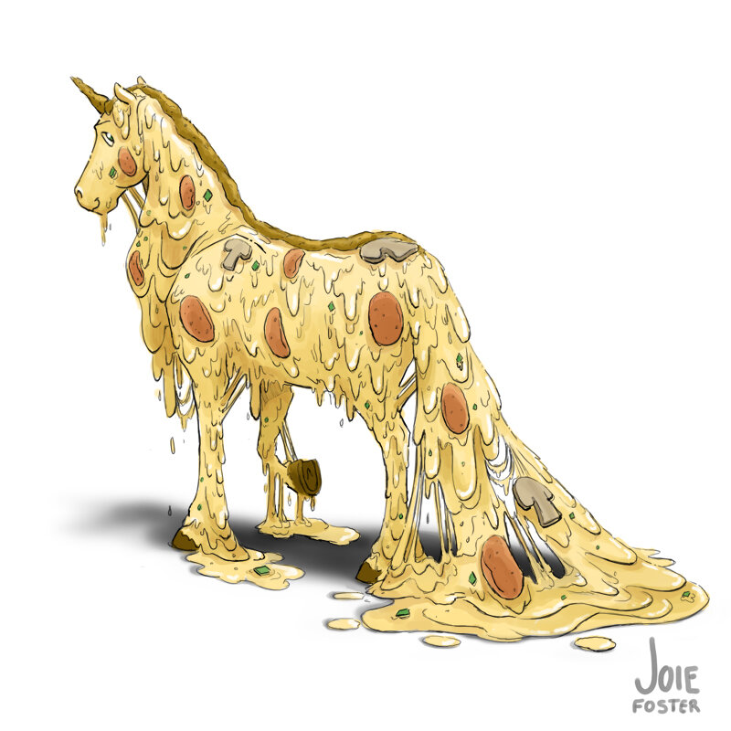
Absolutely none of the 2019 Juneicorns were cheesey jokes. Well ok, except for this one.

Absolutely none of the 2019 Juneicorns were cheesey jokes. Well ok, except for this one.

Hawaii District 2

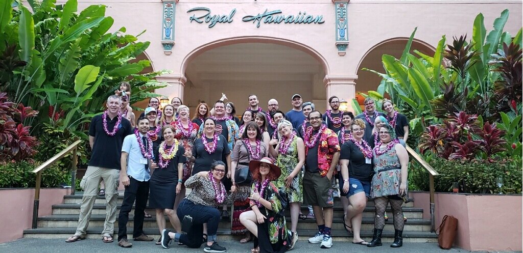
Continuing in the pattern of “Everything slams together in one month, why oh WHY can’t things be more evenly spaced throughout the year: a memoir by Joie Foster,” I had a work trip to Hawaii in June. Fox TV is a union studio, so that meant that I was able to join The Animation Guild (Local 839), and got to help serve my union by being a delegate to the IATSE District II convention in Honolulu.

Yes, I mean, twist my arm it was in Hawaii, but honestly it was two days of real work to build our union’s image, meet and form connections with other fellow IATSE locals, get updated on important legislation, and other tasks.

Zinefest

ALSO in June was TAG’s Zinefest, which was the last convention for me for the year (and forseeable future, if I’m honest). Thankfully, this one was a way smaller (one room), shorter (4 hours) show that didn’t leave me ready to collapse at the end. It was actually an excellent way to network with fellow Guild members and comics creators, and I had a blast!

zinefest.jpg

Learning A to Z

Lastly in June, my previously mentioned work from January was finally released and I could show it in my portfolio! I worked with Learning A to Z on their ELL Grammar Packs, which focus on teaching verbs. I had some pretty complicated illustrations to compose that were jam-packed with “verb-y” details!

Otis College of Art and Design

Things finally started to calm down after June, and my summer was mostly me trying to get my adult life in order. When you’re this busy, things start to fall by the wayside! Remember the Kondo-ing I’d mentioned in January? Well that hadn’t been finished, so I was back to it.

OH BUT WAIT. There’s a moment to breathe? I could start to bring my shoulders down from around my ears? Nonsense, I’ll have NONE of that.

newlogo_insert-black.jpg

Once again, everything got turned on its head in August with just one email from Otis College of Art and Design asking if I’d teach their storyboard class. I was hired a hot 24 hours before class began... so there I was the first day of class, having screamed through LA traffic from Fox to Otis, blinking at a room of 20 students all eager to learn… and I didn’t even have a syllabus.

Anyway, it all came together in the end, and my semester teaching thus far has been both challenging and delightful. I swear my students have taught me more about life than I’ve taught them about storyboards, but I digress. The school liked me enough to ask me to teach this coming Spring semester too, so I guess I haven’t sucked too much!

LASIK

During my hiatus (a normal part of television production schedules where there’s a gap of work in between seasons), I also finally fulfilled a lifetime dream of mine: being able to see into the 4th dimension! And by that I mean getting LASIK to correct my absolutely awful eyesight.

Now I can see through walls!

Now I can see through walls!

Getting surgery on one’s eyes is scary enough, but when your eyeballs are 100% pivotal to the career you’ve built your entire life and identity around… phew. “Scary” is the understatement of the decade (which is almost over so let’s not top that, please?)

But I’m so glad I did it— being able to see better than I ever did with contacts or glasses is one of the best gifts I’ve been able to experience in life thus far. On our annual drive up to Oregon, I was shocked and awed at the gorgeous scenery that I could actually SEE for the first time! Like, in HD detail!!!

Background Design and Site Update

And finally, we’re almost caught up to real time! To help tide me over during my hiatus, I got to do some freelance background design for American Dad. I’ve done quite a lot of backgrounds for animated shorts (and in general with my illustrations and comics work) so it was really fun to do it for a television show! Look for them in the last two episodes of next season!

My corgilicious contribution to the TAG Post-It Note Show on Friday, December 6th in Burbank!

My corgilicious contribution to the TAG Post-It Note Show on Friday, December 6th in Burbank!

I’ve also had a chance to finally give my website a bit of a facelift. Inspired by a Post-It piece I did for the Animation Guild’s Post-It Note show, I added a new logo, restructured my pages, and updated just about every part of the site (which you will likely notice just by reading this blog post).

So when I tell people that 2019 was the craziest whirlwind year I’ve ever lived, hopefully you can see that I am not speaking in hyperbole. I can’t even sum things up in a conclusion, so instead have this excellent photo of my Studio Assistant being the Crimmas Tree Gremlin to wrap things up.

"Hoomans solve my riddlez three to get treatz from Crimmas tree"

"Hoomans solve my riddlez three
to get treatz from Crimmas tree"

So I hope you enjoyed this recap (how many cups of tea did it take you to get through the whole thing?), and that you have a lovely end of your decade.

Did I finish my Kondoing? No. Guess that’s gonna be a two year project now…

Happy 2020, everyone!
"My Shadow" - Illustrations for Learning A to Z

Last year, I joined the SCBWI (Society of Children's Book Writers and Illustrators) with a goal in mind: I wanted to branch out into drawing pictures for kids! I went to the LA Summer Conference and met some of the nicest, most supportive people in the world... and crammed my brain full of as much info as I could at the same time. I now had a mission: add stuff to my portfolio to attract children's publishing clients! Go go! Time's wastin', fam!

Almost a year later, I'm excited to reveal my very first project: illustrations for the Robert Louis Stevenson poem My Shadow, published by Learning A to Z.

LA2Z_MyShadow_p01_final.jpg

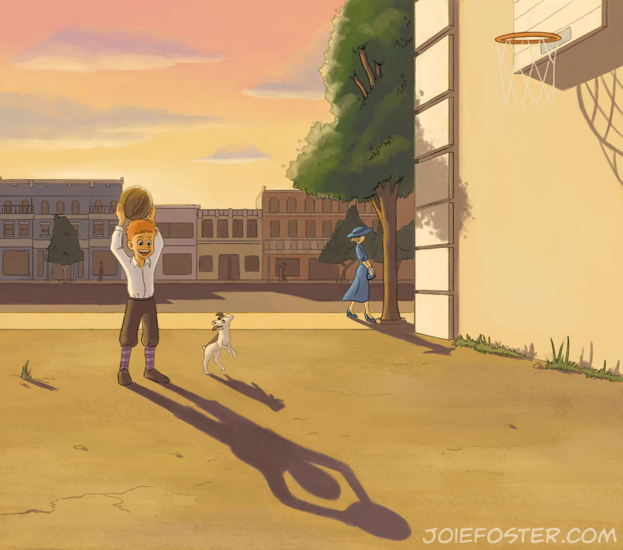
These illustrations were meant to match the poem's stanzas by showing kids playing with their shadows at specific times of day. There was a scene with candlelight, sunset, noon, and one at early morning dawn.

LA2Z_MyShadow_p02_final.jpg

As I was working on the sketches for these, the only thing I could think about was my "Drawing From Imagination" professor, Stephen Player, and the day in his class where we had to learn about drawing shadows in perspective. A notoriously difficult course, that day was so taxing I went home and went to sleep out of sheer mental exhaustion!

LA2Z_MyShadow_p03_final.jpg

As I was painting, I made sure to reference my copy of Color and Light by James Gurney often since there were so many times of day to work with! If you're an artist, you should probably own a copy of that book. It's highly recommended, insanely useful, and pretty much a requirement to own! Get thee to Amazon and get a copy if you don't have it yet. I'll wait.

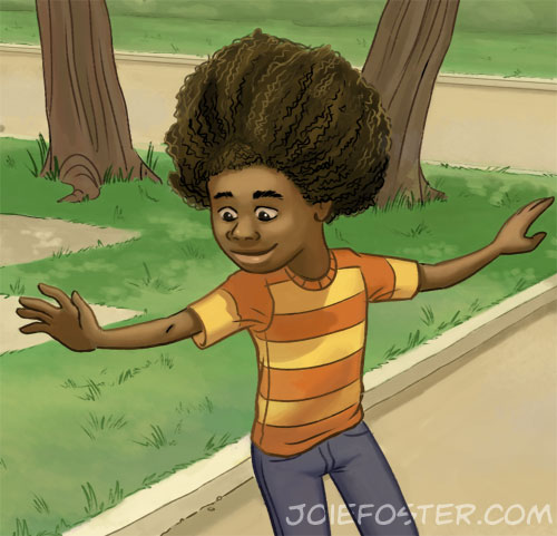
Detail shot of the skateboarding boy!

Detail shot of the skateboarding boy!

With this particular piece, when the sketch round's notes came back, the AD asked me to add a car (specifically an early 70s Ford Pinto in orange) in the background. GASP! HORROR! The bane of many an artist's existence: drawing CARS! Somehow I soldiered on.

Detail shot of the car behind the skateboarding boy!

Detail shot of the car behind the skateboarding boy!

LA2Z_MyShadow_p04_final.jpg

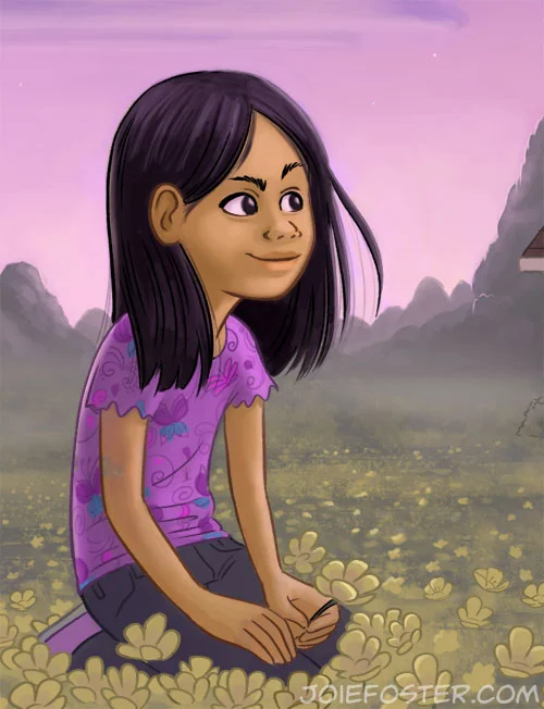
This last one turned out to be my favorite from the series-- no, not because I enjoy painting 10,000 flowers-- but because of the color palette and mood. I've never painted a misty morning scene before, and I quiet enjoy the quiet moment it represents.

Some close-up detail of the girl in the flowers!

Some close-up detail of the girl in the flowers!

All in all it was a terrifically fun project, and I hope to have more kidlit illustrations to share with you in the future! Which one of these is your favorite? Leave me a comment and tell me!

The Making of "Spotted!"

Please raise your hand if in your childhood you wished to discover and care for a secret magical creature of your own? *both of own hands in the air* Now keep your hand up if you wish for the same thing as an adult? No? Only me? C'mon there's gotta be at least some of you...

Did enough iterations to just about animate the pegasus' wings flapping!

Did enough iterations to just about animate the pegasus' wings flapping!

I painted this about two months ago as an assignment Just For Myself (TM). Getting to work 100% for yourself is simultaneously exhilarating and terrifying. You can paint whatever you want! Also, you can... paint whatever you want... and you could easily get trapped because that gives you zero parameters and you'll self destruct in a never ending cycle of indecision.

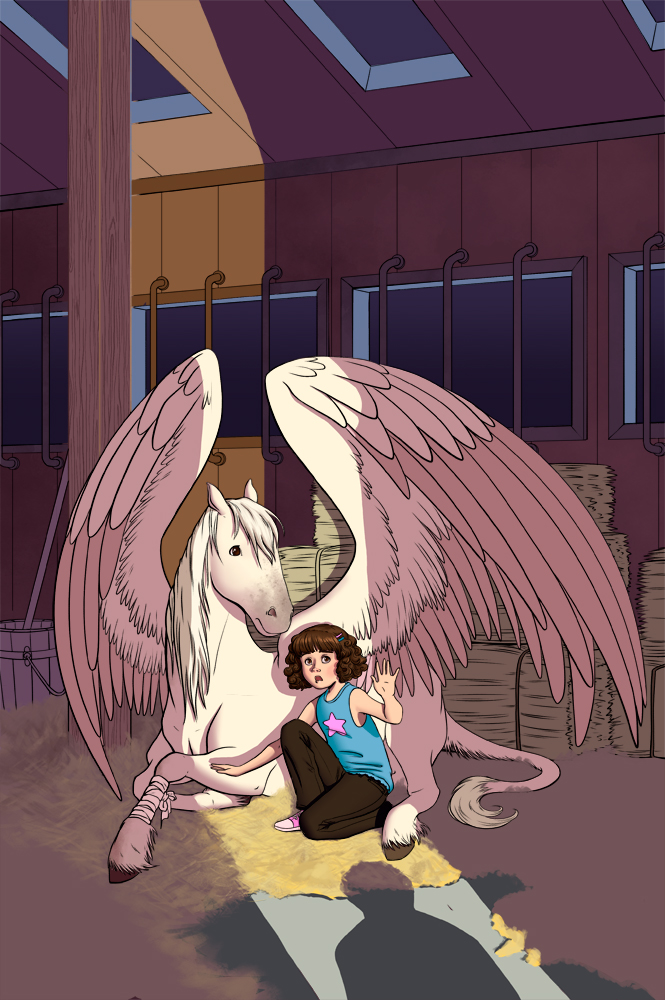
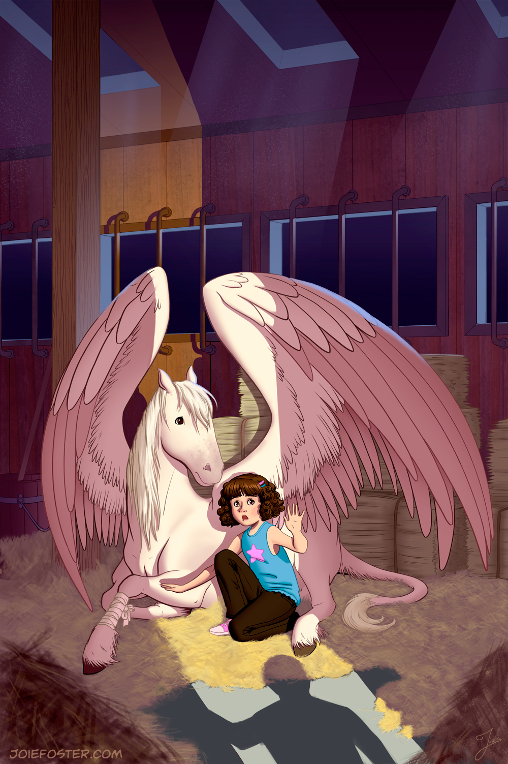
Finally ended up on this-- a cover image for a faux middle grade novel I invented: a girl finds an injured pegasus and has to nurse it back to health. Unfortunately for her, she lives in the modern world which has no magic, so she has to go to extreme efforts to keep the thing hidden. Fun right? Definitely a story I would've gobbled up as a kid. And also now.

The colors, Duke! THE COLORS

The colors, Duke! THE COLORS

So since this was Just For Myself (TM) and I had no deadline, I spent lots of extra time in the planning stages. As you can see, I did 9 different thumbnails to figure out my composition, but that does not count the other 20 or so I did to figure out what scene from my fake story I even wanted to show!  If you're imaginative, you can almost follow along with my thought process:

Okay so they're in a barn together, and I want to show them getting spotted because WHOA that's drama! Ok so first let's see them in a horse stall and see a shadowy figure at the barn's opening. Hmm, ok should the pegasus' wings be unfurled or hidden under a blanket? Hidden under a blanket might make storytelling hard because people won't know it's a pegasus. Unfurled sort of cuts the whole picture in half, especially with those beams in the middle... hmm ok let's take 'em out, switch 'em around... trying adding in foreground elements. Nope ok, none of this is working, let's try a different angle. What if we're looking at them from close to where the shadow figure is standing? Ok we're back to the wing thing again...

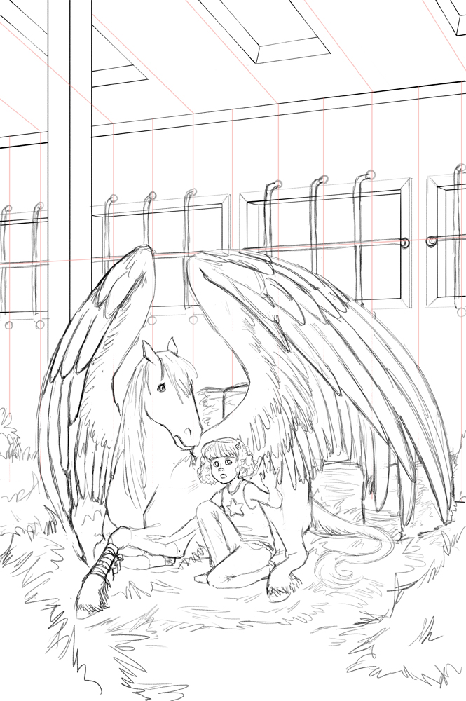
After I'd nailed down what composition I wanted, I did 7 more thumbnails for values, half of which required a more refined drawing. I wanted to try out different dramatic lighting schemes to see what told the story the best way. I also tried a tilted angle (sometimes known as Dutch Angle), but decided it looked like a slasher movie. Scree! Scree! Scree!

The final "rough"

The final "rough"

Then I went through 6 different color schemes before settling on my final "rough." I was ready to go! Well, except not really. I wanted to make sure the perspective on this piece was perfect. Yes, I COULD have done it by hand... but ain't nobody got time for that. So I busted out my ol' copy of SketchUp to model the interior of the barn. Once the model was done, I was able to finally do my pencil sketch on top of the entire thing to get it moving!

Hay Girl Hay! Since they're in a barn! I don't apologize for my puns. Pencils stage.

Hay Girl Hay! Since they're in a barn! I don't apologize for my puns. Pencils stage.

It's at this point that I'd like to point out that I had a TON of help and feedback from what I call my Circle of Trust (thank you Oatley Academy for coining that phrase)! It's important to get outside feedback from trusted artist friends about how a piece is going... especially when there's no client. I showed every single step of my process to my Circle, because I wanted this piece to be the best it could be! Think of it as using sandpaper; outside opinions and fresh, well-trained eyes are necessary to smooth a piece out.

To my Circle: You know who you are since I was emailing you about 20x a week. Thank you! <3

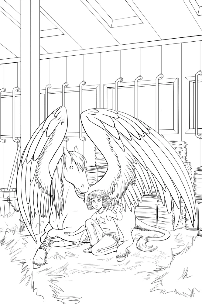
"Inks" is a weird term when the whole process is digital. Just think of it is as "smoother, nicer" pencils?

"Inks" is a weird term when the whole process is digital. Just think of it is as "smoother, nicer" pencils?

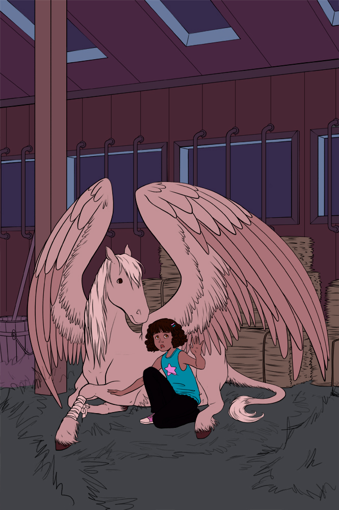
So once I'd gone through all that, I inked the piece. I ended up electing not to ink the hay, as I wanted to achieve the texture through painting. I kept the figures on a different layer than the background, as later I knew I intended to do what's called a "color hold" aka colorizing the lines. You seen any 90s Disney movies? Then you know what I mean.

"Nighttime" flat colors

"Nighttime" flat colors

With this particular piece, I ended up using an approach that was a hybrid of how I do both comics and painting. I flatted the painting, which means I separated out all of the local colors of every object so I could render them later. When choosing my flat colors, I went with what everything would look like in the dark, and then paint in the light afterward!

Rough lighting pass

Rough lighting pass

Which is what this shot is here. You can see that the flat nighttime colors inform the shadows, but the "lights" make those colors make sense. Here I'd started rendering, the hay is starting to take shape... and you'll note that all the lines are still black. Don't worry, you'll see the color held lines in the final piece!

It's finished! Whoopie!

It's finished! Whoopie!

So about 10 hours of rendering, tweaking, and 20 zillion more rounds of feedback, I arrived at the finished piece! You can see that the lines are no longer black-- it's subtle, but the color held makes the drawing of the figures less harsh against the more painterly background.

Also a little birdie told me that people enjoy seeing animated GIFs of a painting's progress (I've only done it once before), so here you go! Hope you enjoy it. If you like it, I'll try to make them more often!

The process with more in between steps added!

The process with more in between steps added!

Do you like it when I make "client-free" work? Do you like pegasuses? Pegasi? (Whatever the word is). Do you like process posts and animated GIFs? (Pronounced like GIF, not JIF, this isn't peanut butter thankyouverymuch). Feel free to leave a comment and tell me your opinion! It's the internet, sharing opinions is everyone's favorite thing. Don't be shy, I'll respond!

Ghost Coast

GhostCoastFinal

All my life I've enjoyed spooky things ("spoopy" as the internet calls it). As a kid I would gobble up any sort of ghost or alien-related media-- I had just about gutted my local library of anything it had on the subjects. The Goosebumps series by R.L. Stine was definitely a favorite of mine, as well as Scary Stories by Alvin Schwartz. Whether it was fictional or real-life accounts, I wanted to read it! My aunt and uncle took me to London at the tender age of ten, and I was excited and desperate to visit the Ghost Tower in Warwick Castle. Finally, I'd see some ghosts and learn that IT WAS ALL REAL! (Think of Baby Joie as a preteen Agent Mulder, yeah?) Sadly, no ghosts made any appearances, but I kept on reading and hoping one day I'd see something.

Even though I'm more of an Agent Scully now in my adult years, I still can't get enough of horror/paranormal/spoopy entertainment. When I was thinking up ideas for new illustrations recently, I remembered that horror-for-kids is a thing. In fact, I recently read a middle grade horror novel called Took by Mary Downing Hahn. (I really enjoyed the book a lot, btw). So, why not try something like that? I decided to cook up a faux middle grade novel about a bunch of kids who investigate paranormal stuff. Turns out it's a sub-genre which already exists in droves, based on my recent trip to the book store... but whatever, I wanted to do it anyway!

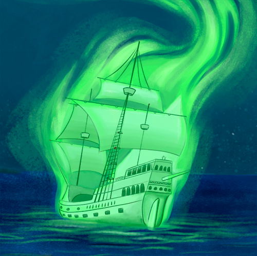
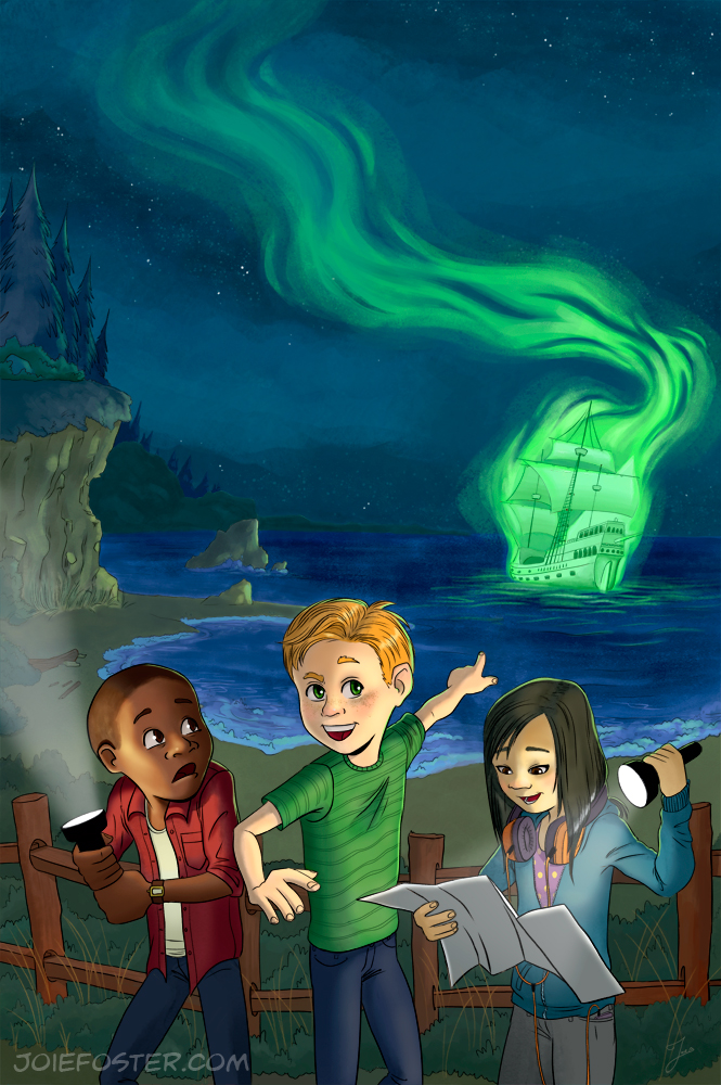
I didn't want the cover for this faux book be just a regular ol' "kids exploring haunted house" thing, though. I wanted something interesting and new-- I wanted the setting to be unique. They say draw what you know, right? Or does that just apply to writers? Anyway, I decided that the coastline of Oregon was perfect since it was so beautiful and specific. And, what sort of ghosts might one find near a coastline? A ghost SHIP! Of course the rhyme of "Ghost Coast" was my husband's invention, and I couldn't not use it.

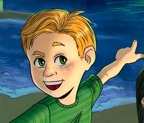
So looking at photos from Battle Rock Beach and the general surrounding coastline of Port Orford, Oregon got me started. I've spent a lot of time up there, considering it's where Joel is from... and we also literally got married there last year. Dramatic rocky cliffs slathered in evergreen forest jutted up against a beach? You got it. Let's add in some kids who have found a map that draws them to the area and are an appropriate mix of "this is terrifying," "this is cool," and "I will conveniently miss any paranormal activity because I am always looking in another direction" respectively. (Of course, gentle reader, the latter's name is clearly Dana).

And finally, we'll add the "ghost." And I mean just look at that sick ship. Sick as in "it's a sickly color" but also "the concept of a ghost ship is cool." I'd be totally into seeing something like that when I go to the beach at night soon.

I enjoyed creating this illustration so much that I am going to do more with these same kids. So keep an eye out for that if you like this sort of thing. If you don't, there's not much I can do about that. Have a spoopy day!

Draw This: Celebrate

Three different quick thumbnail sketches to decide on my composition

Three different quick thumbnail sketches to decide on my composition

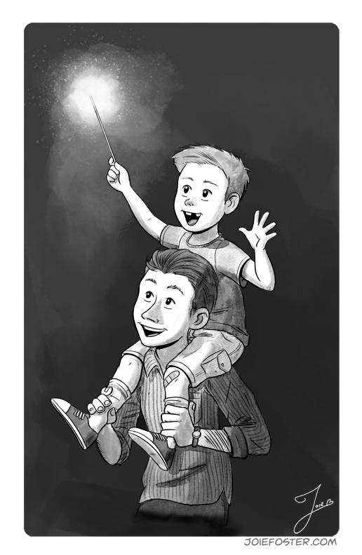
So the SCBWI does this monthly thing called “Draw This" for illustrators. They give out a monthly prompt word, and I thought "Well why not, this sounds like fun!" The prompt word was “celebrate” and since the 4th of July just happened (and annoying illegal fireworks going off until 2 AM in my neighborhood is STILL happening), I thought I’d do my piece of kid with a sparkler, enjoying the 4th with his dad. So let's see how it came together!

Drawin' it in more proper-like, but they ended up creepy eyes...

Drawin' it in more proper-like, but they ended up creepy eyes...

Fixed the eyes, and put in some sketchy shading to decide how I wanted to render it!

Fixed the eyes, and put in some sketchy shading to decide how I wanted to render it!

Inked this bad boy up, so now we're ready to go to (digital) watercolor!

Inked this bad boy up, so now we're ready to go to (digital) watercolor!

Done! Fun fact: I've never actually held a sparkler in my life.

Done! Fun fact: I've never actually held a sparkler in my life.

If you're an artist and you like both watercolor and digital paints, you should definitely buy Kyle T. Webster's brushes! They're magical.

UPDATE AUG 1: I was really surprised to get an email this morning telling me that I actually was one of the competition winners! I've never won anything, so this was a SUPER amazing day for me. Thank you, SCBWI!

New Illustration and Website!
Today is a day of new things: new illustration, new website, and fun new career goals! Wait, what?! I’m getting ahead of myself, let me explain!
First– my new illustration, Spotted! A girl who rescues an injured pegasus must keep it hidden from the world that won’t understand its existence? This is totally one of my 12 year old self’s fantasies. Straight from the heart, for sure! This piece is meant to be a cover for a mock middle grade novel of my own invention showing us a tense moment when the girl’s pegasus is spotted!

Second– new website? Why yes, you're on it right now! Awhile back, I had some technical issues with my old illustration website (you remember JoieArt.net, right?) and I had to take it down, redirecting the URL to my comics website. Now that my comic site’s hosting plan is up for renewal, I decided to move hosts, relaunch my illustration website and consolidate everything on here! Make sure to change your bookmarks!

Third– over my career thus far I’ve worked in a lot of industries simultaneously including table top games, theme park design, animation, and primarily comics. Diversification is the name of the game when you’re a freelancer!

I’ve been wanting to reinvigorate the illustration side of my business for awhile now, and children’s literature has always appealed to me. When I found out about Middle Grade* publishing, I got extremely excited and wondered if it was something I could do, too. In my research so far, I’ve found quite a few all ages comics artists that I admire cross over into the line of Middle Grade illustration, and I think that’s got a lot to do with both industries having similar topics and art styles. Plus, I’ve had no less than three art friends/colleagues practically hit me over the head telling me to try it– so now it’s a new goal of mine to work toward!

Since this goal takes me into uncharted waters (for me), I have a ton of research to do! I’m excited though, because doing illustrations like this hits a nostalgic nerve that is hard to describe. My time between the ages of 9 and 13 is precious to me, as it was when my imagination was free to roam and my creativity was at an all time high. I’d love to recapture some of those moments in illustrations, and perhaps inspire a “Me too!” moment in my audience as well.

joiefoster_pegasus_detail2.jpg

So that said, there’ll be more illustrations like this popping up soon! I’ve got another one that’s almost finished, and quite a few more in the planning stages. Additionally, I’m going to the SCBWI conference this weekend here in Los Angeles and it promises to be an amazing time. I’ll be sure to blog about my experience there later!

*Middle grade is a term for books that typically are targeted at kids ages 9-12, give or take

How to Get your Children's Book Illustrated

LA2Z_MyShadow_p04_final.jpg
“I’ve been working on a children’s book for awhile now, and I’m ready for an illustrator.”
"Oh, my aunt has written a children’s book, are you interested in doing the illustrations?”
“My brother has a great idea for a kid’s book and is looking for possible illustrators.”

Have you heard these phrases before? Have you said these phrases before? Do you (or your friend or relative or neighbor) have a children’s book manuscript that has been toiled on for hours, painstakingly constructed, edited, and reviewed… and now it’s ready to be brought to life with beautiful watercolors, gouache, or digital paint? If so, then this guide is for you!

“Will you illustrate my children’s book?”

I get a lot of inquiries about illustrating people’s children’s books. It seems that everyone these days has an idea for a book or is working on a book– including you! Now you want to know if I (or another artist you like) can illustrate it for you.

Let me just stop you right there.

Yes, I mean red light, full stop.

You don’t need an illustrator.

Or rather, you don’t have to find one. Your publisher will find one for you. They have artists that they use regularly, and access to tons more if they’re looking to use new talent. As a matter of fact, publishers get pelted consistently with artwork samples, postcards, and book dummies from illustrators like me! Publishing houses have highly trained individuals called Art Directors who are able to select the best artist for the job once they’ve purchased your book. Plus, they save you the pain of coming up with contracts, negotiating, and paying the artist.

“But wait, I don’t have a publisher!”

Aha, and there is the meat of all of the emails, messages and phone calls that we artists get.

You’ve written your book and you assume that the next step is to get the entire thing illustrated before pitching it around. “It’s a picture book, therefore it needs pictures,” you say. I absolutely understand that; it’s a common misconception that I’m here to set straight. I mean, novels are fully finished before they’re pitched around, right? Why not your children’s book?

Well, the kid’s book industry is a little different. Consider this: a publisher gets a copy of your manuscript and– holy cow, it’s amazing! She’s floored, and she wants to hand you a three book deal right away! The only problem is that the manuscript came in with 32 illustrations, and they’re terrible. Terrible, awful, no-good, and very bad. Or maybe they’re great illustrations but they just don’t match your writing well.

She doesn’t want to buy the illustrations… but because they came in with the manuscript, they’re now tied together. Womp womp. Into the slush pile your book goes.

When you send in your manuscript with artwork, you now not only have to wow them with your writing, wow them with your friend’s/artist’s illustrations, and wow them with the two paired together. Frankly, you might both be amazing, but if the story and art aren’t well matched, it’ll be a no go.

It’s already difficult enough to have your voice heard in the absolute cacophony that is our world today– do you really want to make your chances at getting published smaller? Even if you really like the illustrator you’ve selected, the chances are your publisher will find a better match!

I’ll let the Society of Children’s Book Writers and Illustrators back me up here:

“Except in rare circumstances, it is seldom a good idea for authors and illustrators to collaborate together before publication.”(source)

Well, I just want to send in some illustrations as possible suggestions. Is that ok?

You can if you really want to, just be sure to note that in your cover letter. If you’ve never been published before though, I wouldn’t. And if you insist that your manuscript needs illustrations to be understood, well… I’ll let the SCBWI back me up again:

(…) If your manuscript doesn’t come to life visually without being explained, then it probably needs work.”(source)

An exception to this rule, however, is if your book is very high concept such as Press Here by Henré Tullet.

Ok ok, so how do I get published?

It’s a very similar process to how we illustrators get work in the kid’s book (or any) industry. Create content and submit it. Get rejections? Practice your craft, create more content, and submit again. Do your research. Only submit to publishers that are a good match for your work. Take a class, practice, create content, and submit again. If you’d like more information, check the links at the bottom of this article.

What if I’d rather self publish?

Self publishing is absolutely a viable option, but you have to know if it’s right for you. It’s an extremely expensive, difficult, and time-consuming option, even with the ease and availability of digital publishing in today’s market.

Let’s start with the most obvious cost: the illustrations. And yes, you need to pay for them. Please don’t offer “exposure” or profits as payment.

According to the GAG’s Handbook for Pricing and Ethical Guidelines (13th Edition), the appropriate price range for illustrating a 32 page hardcover book (including the book jacket) is anywhere from $3,000-$12,000+.

I’m sure you’re reeling from sticker shock, but that pricing is absolutely not something I bat an eye at. Doing artwork for a book is a really involved process. There’s planning, design, thumbnails, revisions, drawing, painting… each illustration will take a large amount of time, and art supplies aren’t cheap either.

And that doesn’t include printing costs (if you’re going with print instead of digital) or app building for iPad and Kindle (if you’re doing with digital instead of print).

I’m definitely not trying to discourage you, but you need a realistic picture of what this venture will look like. You will have to hustle, promote, and advertise for your book all on your own– it’ll take quite a bit of research and hard work to achieve.

Hard work? That sounds like me! Let’s DO this!

Well if you understand the expense and challenges ahead, by all means! Self publishing can absolutely be a way to succeed and be creatively fulfilled. It may actually be a better option for you depending on what you want to do with it! And if you need help with financing, Kickstarter is always an option.

No, I don’t want all those bells and whistles, I just want to create a nice keepsake for my kids.

That’s also totally fine! You can write the book, get it illustrated, then you can print a few copies with a POD (Print on Demand) service such as CreateSpace or Lulu.com. Since the book is mainly for personal use and you’ll be on a tight budget, you might try searching for a student instead of a professional to create your illustrations for you (but yes, you do still need to pay them). You could also try websites such as Fiverr or PeoplePerHour, but realize that you’re going to get the quality that you pay for.

In closing

I hope I covered all possible bases here, and that you found this guide helpful to you. A lot of kid’s book questions pop up because there are misunderstandings about the industry and process– but now you are more educated and can forge ahead to make the most amazing kid’s book that you can create!

If I missed any question that you have, feel free to leave a comment or email me. If you like this post, or know a friend who might benefit from the information, please feel free to share it.

Additional Reading

SCBWI – Joining the Society of Children’s Book Writers and Illustrators will give you access to wonderful resources, publishing house contact information, and a database of illustrator’s portfolios:

www.scbwi.org

Articles with further information about (NOT) submitting manuscripts and artwork together:

http://www.underdown.org/picture-books-illustrations.htm

http://danidraws.com/2009/01/22/how-to-find-an-illustrator-for-your-picture-book/

Information for getting published in the Kid’s Book Industry:

http://www.scbwi.org/frequently-asked-questions/

More information on self publishing:

http://www.scbwi.org/online-resources/the-book/

http://danidraws.com/2013/01/12/how-to-find-an-illustrator-for-your-picture-book-part-2-the-self-publishing-edition/

http://www.thecreativepenn.com/2011/08/13/how-to-find-an-illustrator-for-your-book/

Guide on contacting an artist you’d like to hire:

http://kmcmorris.blogspot.com.au/2015/04/self-published-authors-10-tips-on-how.html