Illustration

2014 Year End Wrap-Up!

So... I know Christmas and New Years was a good month ago, but better late than never, I say! I had one heckuva set of Happy Holidays, and have been on the road since mid December. My nomadic tendencies aside, I've been working on quite a few projects that unfortunately I can't show yet. That doesn't mean I haven't been doing anything though!

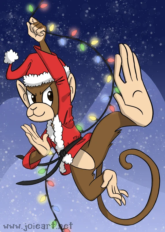
Now that the holidays have passed I can show the fun corporate holiday card that I did for Kung Fu Monkey Productions here in Burbank, California. They're a fun bunch, and really let me have fun and do whatever I wanted with the material!

Then I was off to Georgia for Christmas, and Oregon for New Years where I received this truly amazing Christmas Sweater from my friends. They hand sewed all those little appliqué animals on there! They also don't really know how to sew. Blood was shed and friendships strained in the making of this sweater, but I love it and have been wearing it with glee.

That's all for now!
FoxDeploy.com Has some JoieArt On It!

tumblr_ngdptyLR4h1rxspejo4_1280.jpg

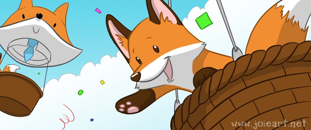
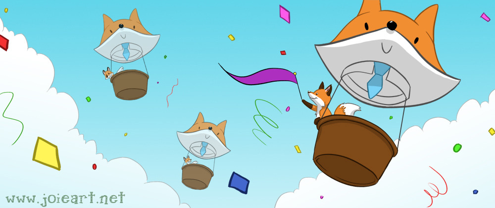
Recently I completed another client job for the website FoxDeploy.com, a great blog about Powershell and other super high-tech programming things that I know absolutely nothing about. I know just enough coding to keep a website running, and that’s about it. The blog was celebrating its 100th post, and wanted a great banner image to go with it! And with a name like FoxDeploy, of course there were going to be foxes.

tumblr_ngdptyLR4h1rxspejo3_1280.jpg

“Give me all the foxes” the client says to me cheerfully. “Lots of foxes, in fox-shaped hot air balloons!”

“Can I add confetti?” I ask, always wanting to shoehorn rainbows and glitter into my work.

tumblr_ngdptyLR4h1rxspejo1_1280.jpg
tumblr_ngdptyLR4h1rxspejo2_1280.jpg

“Foxes! And Balloons! And Confetti! YES!”

So congratulations to my client (and friend!) Stephen Owen of FoxDeploy.com, and here’s to another 10,000 posts on your blog! 

Branding for Blogs, Youtubers, and More!

(Updated for 2017)

These days almost everyone has a side hustle! Creating content such as streaming video games, selling on Etsy, creating videos, and writing blogs have become so commonplace that you likely know someone within spitting distance who does it. Maybe it's even YOU! And if it is you, you know that all the advice on "how to start a Youtube channel, blog, Twitter, etc" yields the advice of "you’ve GOT to have branding!"

Blog header for Diary of an Aspiring Loser, a weight loss blog

Blog header for Diary of an Aspiring Loser, a weight loss blog

Branding is defined as a "look" for your online & social media presence. Maybe it's a banner on your Twitter, a user icon on Twitch, or title cards in your video. You want someone to see your various outlets online and be able to immediately recognize that it's YOU. Good branding will boost your business and image... bad branding will undermine it.

Banner for Twitch/Youtuber ComboDropper

Banner for Twitch/Youtuber ComboDropper

Design for Twitch entertainers Date Knights

Design for Twitch entertainers Date Knights

That's where someone like me comes in. What better way to brand yourself than with a cartoon? It could be your cat, what your content is about (games? baking? fishing? even coding!), or it could even be of yourself-- the possibilities are endless.

"Update" art for Date Knights' social media accounts

"Update" art for Date Knights' social media accounts

When a client comes to me, we start by having a chat about how what it is they do, what they create, and how they want to come across to their audience. After we chat I provide sketch options, and after we put our heads together, I come up with the final piece for them to use. I typically work for clients who represent a light-hearted, humorous feel-- with great results!

tumblr_nfb0cqktpi1rxspejo4_r1_1280.jpg
foxdeploy400kFINAL_website.jpg
Banner designs for Powershell programming blog Fox Deploy.

Banner designs for Powershell programming blog Fox Deploy.

If you're a content creator and you need colorful, stylized cartoons to help solidify your online presence, I'm your gal! Please feel free to contact me at joie@joiefoster.com

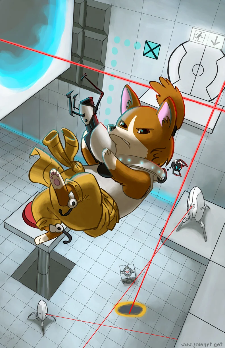
A-paw-ture Science

tumblr_ncsd4oItYk1rxspejo1_1280.jpg
“Spectacular. You appear to understand how a portal affects forward momentum, or to be more precise, how it does not. Momentum, a function of mass and velocity, is conserved between portals. In layman’s terms: speedy thing goes in, speedy thing comes out.” – GLaDOS

After my last Portal Corgi piece’s success, I really wanted to up the ante and do a version with the the “Chellsh” Corgi in the test chamber. I started this piece two years ago, but it kept getting forgotten or pushed to the back burner for various reasons. Hope you enjoy it!

Art Imitates Art - Album Cover for Worth Taking

I’m really excited to announce that I did the front cover for Worth Taking’s new album “Art Imitates Art” that’s available on 8/12!! Worth Taking is described as “Nerds in a pop-punk band.” Check ‘em out!

Pre-Order their new album here! http://worthtaking.bandcamp.com/album/art-imitates-art

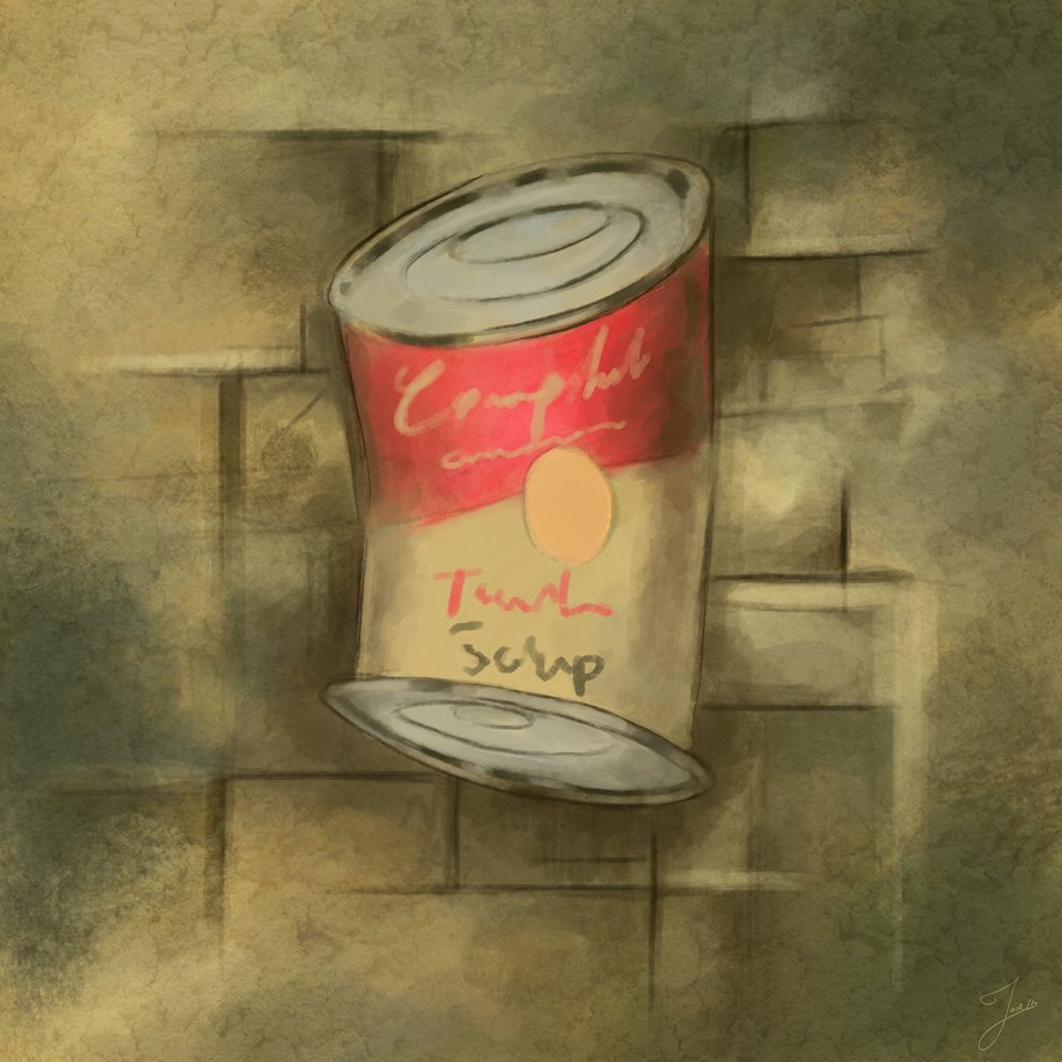
The piece is inspired by the album's name "Art Imitates Art." I ended up choosing two very well known movements from art history, and combined them as if one were imitating the other. Can you guess which two I chose?

"Atlantis" Process

Who doesn’t like dolphins? As a kid, I was obsessed with Ecco the Dolphin. I played all three Genesis games in the series, the Dreamcast version, and even got into a fierce bidding war on Ebay for the original soundtrack. I once spent about five hours randomly punching letters into the passcode level select stage so that I could get past really difficult levels. Would you believe that over a year, I actually managed to hit enough combinations that I got every level in the game? I mean I finished the game the normal way as well… but yeah. I was obsesssed.

Dolphin guards don't play around

Dolphin guards don't play around

Many a dolphin drawing and Ecco fanfic came out of my overly excited, young self. My favorite book was A Circle in the Sea by Steve Senn, which is fins-down the best dolphin fiction I’ve ever read. I even wanted to be a dolphin when I grew up– the major hang up was that I’m not a very good swimmer, so there went that dream. Whoops.

Initial sketch ideas

Initial sketch ideas

So now that I’m a “grown-up” (sorta) I thought I’d use the 23 years of practice I have on my 6 year old self to make a cool dolphin environmental painting. One day on my lunch hour I started doing thumbnails and concept sketches to decide what I wanted to do. I decided I wanted to tell my head-canon version of the Lost City of Atlantis– a city that was built by undersea creatures as a refuge from humans. The idea is that humans were never involved in Atlantis and certainly aren’t welcome there. We, the viewer, have discovered it… but a dolphin guard isn’t happy that we’re here.

Rough drawing

Rough drawing

I wanted to design what a dolphin sentinel that protected the city would look like. If a dolphin wore armor, how would it work? Obviously it would need to be articulated to move properly with the way that dolphins swim. It would need to function as both armor and a weapon, without encumbering the animal too much. I decided that lightweight armor would serve a dolphin best, as they would likely be a type of soldier/guard that relied on speed and agility.

Color exploration

Color exploration

The sort of armor I came up with is relatively minimalist. It protects the animals back, head, and blowhole. The front is bent upward so that the dolphin’s echolocation is uninhibited. It has razor edges, so that the dolphin could sail by an enemy and cause damage without having to manipulate anything. The big weapon though, is the narwhal-inspired horn in the front. It’s a magical element, so not only is it useful for stabbing, but it magically makes the armor lighter overall.

Detail of this pissed dude

Detail of this pissed dude

The city itself has a lot of round shapes. If you’ve read the aforementioned A Circle in the Sea, you’ll know that in Senn’s world, everything is circular to a dolphin. The sun and moon run on a circular path, the tides and currents are circular, a pod is called a “Circle”, and… well, y’know, the Circle of Life. So I wanted a lot of circles and curves in my Atlantis because that book made such a HUGE impact on my young mind.

Shiny, shiny lights

Shiny, shiny lights

The painting itself took six months from inception to finish. Why? Not because it actually took me that long to plan and paint. I’d say that only took maybe 15 hours or so. It’s because I did all the concept art and planning and then straight up forgot about it! Err… oops. That’s ok though, because I just finished up an Environmental Painting class over at Studio Arts taught by super cool dude Alex Ruiz, and the stuff I learned in that class really helped me bring this painting to the level I wanted it to be!

a super sweet animated GIF I made of the painting’s progress. Watch it and say, “Ooooooo, technology!”

a super sweet animated GIF I made of the painting’s progress. Watch it and say, “Ooooooo, technology!”

Castle By the Sea

tumblr_mwtz95Ai5j1rxspejo3_540.jpg
tumblr_mwtz95Ai5j1rxspejo2_540.jpg
tumblr_mwtz95Ai5j1rxspejo1_540.jpg

I did an ink drawing of a seaside castle on a cliff during my lunch hour last Friday. It was one of those drawings where I just started making shapes to see what would happen. After it was finished, I decided that it would be fun to slap some values on it, and then couldn’t resist adding color… which then turned into a partial painting before I decided to call it quits. It was a lot of fun just letting the artwork decide for itself what it wanted to be!