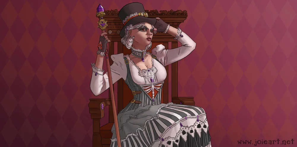
I just finished a piece for a new client, Space Monkeys Down. They're working on a card game named Topexx Dominion. “Topexx Dominions is a tactical combat card game where you, as the General of your army, are pitted against other armies in a battle for supremacy.”
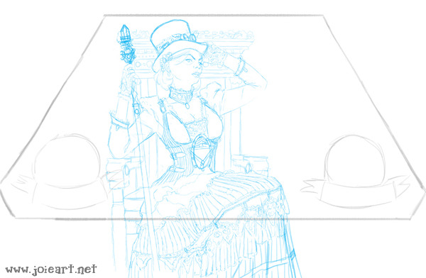
An illustration project like this begins with thumbnails. As you can see, these two drawings are super sketchy and undetailed– why? Because I hate thumbnails. Almost everyone does. But they’re an extremely necessary part of art creation to figure out composition and image placement. I had to be sure my clients liked the pose, and that it worked within the half-hexagon shape required for the card.
Once the thumbnails were approved, I took some reference images and moved onto the drawing. I drew this picture in blue for absolutely no reason other than that’s what color my pencil happened to be. There’s no magic trick there or anything.
Once the AD and I figured out some details in the clothing and tweaks in the layout, I moved onto inks. The client wanted a comic book-esque feel, but with a fully rendered painting underneath. Wooooof, inking all of that lace, the flowers, the stripes, and jewels? I think my hand was going to fall off. And it’s my own fault! I chose lace! I chose it.
Then I moved onto color comps (above) and the color rough (below). I gave the client two different lighting choices for this project, and once they picked what they thought worked best for the character, I roughed in the colors and shadows. Then I rendered and rendered and rendered and rendered and rendered until we got to the finished image!


